Sensor Analytic Dashboard
B2B Data analysis Platform Design
Timeline: Feb 2021 - May 2021
Role: UI/UX Designer
Projects collaborated with Designers, PM, Data Analysts, and Front-end Engineers
Overview
Worked and collaborated with the engineering team to enhance the Business end dashboard for intelligent terminal sensors. My part was explicitly working on a dashboard page, data analytic & data visualization page, and information searching system.
Problems are:
No clear data representation
Difficult to search for categories
The design goal is:
help businesses monitor and control the data of the whole sensor system more conveniently.
Our users use this system aimed at intelligent building automation, which means they will not spend much time on the dashboard to explore and analyze by themselves every day.
The solution is:
create a simple, straightforward interface
easy-to-view data analytic page to quickly grab information, alerts, and reports by user needs.
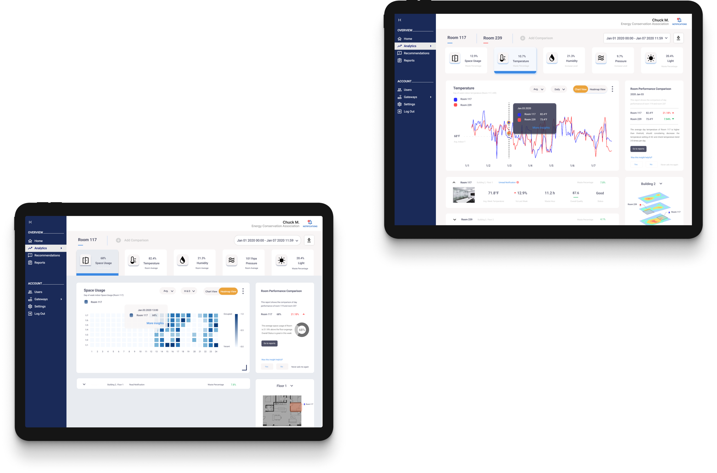
Humidity Page:
Humidity pages include data visualization trends and highlights. Also, it has the opportunity to dive deeper into specific rooms details, reports, and insights
Space Usage Page:
The space usage page uses a heat map to show the trends to alert unnecessary wastage. It aims to better facilitate overall usage efficiently.

Challenges
The challenge was demonstrating the data in an easily accessed way while users could get the capability to dive deeper for more details.
Data overview is another challenge because different sensors don’t share similar measurements, and the sensors are located differently. How to produce an overall number to quick check-in is a big problem.
User Research
The research goal is to find and understand current users’ goals and challenges while managing and supervising the working spaces. Users are owners and managers who need help with managing working space without unnecessary wastage. The research is conducted thru weekly meetings with stakeholders and teams. Based on their reflections on previous versions and their further needs, I summarized into four points:
Track the status and trend quickly and efficiently
Alerts based on threshold and provide reports and suggestions
Freedom to customize info while less time is required to make choices
Clean and simple interface to hands-on and capability to expand and fold the details


What are users looking for?
Track data overview
Customize Free
Dive into details
Updates & Insights
Design Solutions
Build an overview of 5 data type widgets
Selection bars & Advanced researches
Expanding & Collapsing of widgets
Hover function and Insights widgets
Information Sorting

I worked on different kinds of user flows and layouts about searching bar, data type and analytic mode. From this stage, I started to work on information sorting. I tried different options about keep user experience but also advanced options if user would love to get more information.
Sketches
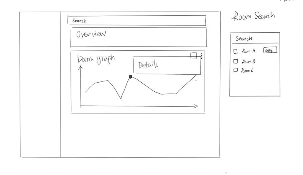

I sketched searching bar, data type and analytic mode. I tried different options about keep user experience but also advanced options if user would love to get more information.
Low-fi Prototypes
Iterations & Testings:
Five data types
The five data types ( Space Usage, Temperature, Humidity, Pressure, and Light) are the main manual bar for users to choose which type of data information they want to check on analytic pages. The data type buttons have to show an overview of data information for users to quickly understand the trend before getting into details and reports.
Initial Design
stakeholders and internal teams consider the data unit is separate, it is essential to align all the data buttons and data trend measurement units so that users can quickly understand the overall data information of their sensor.
Based on their feedback, I chose the increased level as the trend measurement unit for five data types, chose simpler icons, and focused more on data type names and actual numbers.
Analytic Mode:
Analytic Mode is the section where users can customize their data type preference, including time range, data visualization choices, data range, sorting the order, and indoor/outdoor. These choices give users more freedom to manually choose the specific data they want to check in the sensor dashboard.
After usability testing, target companies and internal teams consider the dropdown list and sliders components an excellent tool for making choices. It is essential to keep the interface clean and expand to make more choices since users want to make detailed choices quickly and easily.
Based on their suggestions, I made the final design combining sliders and a dropdown list. If there are more than two choices in one category, such as data range, people can use sliders to choose. Also, the dropdown list allows people to select multiple options if capable.

Final Design
Initial Design
Final Design
Final Deliverables
Data Visualization Map
Working on room comparison map
Individual Room Status
Check in for one room performance and comparison
Data Comparison
Customizable room selection and preferences information stored
Hover Function
Hover on the data visualization map to get specific data
Five Data Types
Brief Trend overview, different section selection
Data Insights & Reports
Comparison details, data insights, and options to reports
What do I learn?
I learned that as a UI/UX designer, my duty is not only to build a solid user experience on web design but also to design based on user feedback and engineering perspectives.
Working on animation might help with better visual communication and storytelling between cross-functional teams.
Challenges
The challenge was demonstrating the data in an easily accessed way while users could get the capability to dive deeper for more details.
Data overview is another challenge because different sensors don’t share similar measurements, and the sensors are located differently. How to produce an overall number to quick check-in is a big problem. I communicated with teams and target companies, and understanding their needs for overview is about understanding the daily wastage. Finally, the data overview will be the waste percentage and increased space usage rate, temperature, humidity, pressure, and light within a specific time.